
And how to make yours better
You've probably seen them on noticeboards and social feeds, advertising everything from charity fundraisers to festivals and business breakfasts. Glossy graphics, dramatic lighting, impossibly attractive people, colours turned up to full. They look polished, and they all look strangely alike.
There's a name for this kind of content: AI slop.
Using AI to make a poster isn't the problem. For a small business or a community group with no design budget, it's a genuinely useful option. The problem is that something can look professionally designed without being well designed. I wanted to test that.
Why AI defaults to the same look
Image generators learn from huge collections of pictures, picking up patterns in composition, colour, typography and style. Give one a vague request and it falls back on the most familiar version of whatever you asked for. Ask for a business photo and you'll probably get attractive colleagues smiling in a glass-walled office. Ask for something motivational and someone will be standing on a mountain at sunrise.
So what happens when you ask for a music festival poster?
The experiment
I asked ChatGPT to make a poster for a fictional festival in Wicklow. First with the kind of prompt most people would write, then again with some proper creative direction. The festival details stayed the same both times.
Attempt 1: the typical prompt
Here's part of what I wrote:
Create a stunning, professional, eye-catching poster for Summer Vibes Music Festival 2027, taking place on 17 July in Wicklow, Ireland. Make it visually spectacular, with vibrant colours, amazing graphics and an exciting festival atmosphere. Include a large crowd enjoying live music, a dramatic stage with impressive lighting, and a beautiful sunset. Use bold, modern typography and make the poster look premium, polished and high-quality. It should be energetic, inspirational and really stand out. Write a catchy tagline for the festival and any other text the poster needs.
It's a reasonable brief. It says what the event is, where and when it's happening, and the atmosphere I wanted.
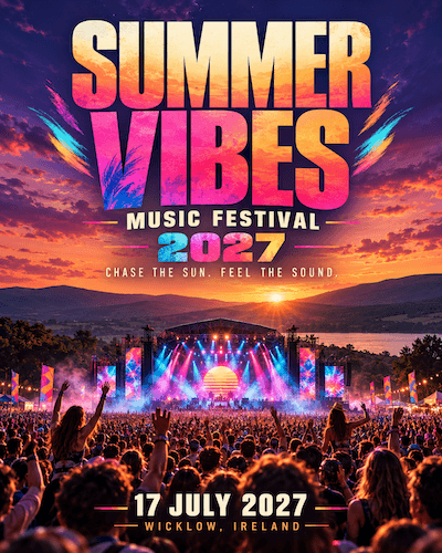
Attempt 1: every festival, everywhere, all at once.
The text is readable, the colours are bright and you know straight away it's a festival. It isn't a bad image.
I asked for a crowd, a stage and a sunset, and ChatGPT delivered all three at full volume: a blazing sunset over hills and a lake, a sea of raised hands, a stage lit in pink and blue, flags, festoon lights and two women up on people's shoulders. There's even a second sun, striped and retro, on the screen behind the stage. Change the name and it could advertise almost any festival anywhere. For something whose job is to grab attention and be remembered, that's a real weakness.
I also let it write its own words. The tagline it came up with was "Chase the sun. Feel the sound." It sounds upbeat and says nothing about this festival. Apart from the date and place, that's all the copy there is: no line-up, no tickets, nothing about what you'd actually get. ChatGPT knew what a festival poster looks like, but not what someone needs to know before buying a ticket.
Attempt 2: showing it what I liked
This time I didn't ask for "stunning" or "professional". I found four music posters with styles I liked: bold type, limited colour palettes, unusual layouts and graphic illustration. Some were minimal, others more experimental.
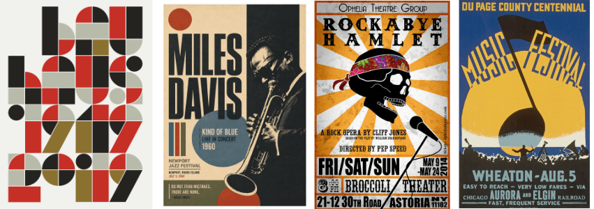
The four reference posters I shared with ChatGPT.
I uploaded them and asked ChatGPT to analyse their typography, colour, composition and illustration, then create an original poster using those principles without copying any of them. I also told it to avoid the glossy, hyper-real look of the first attempt.
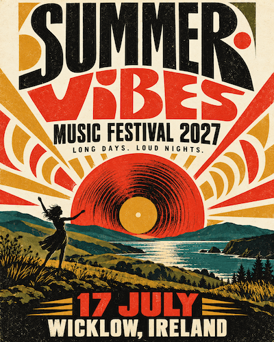
Attempt 2: a real idea, but the sunset survived.
It's a big improvement, and the crowd and the stage have gone. In their place is an actual idea: a vinyl record setting like the sun over the hills. The type has character, the palette is restrained and the screen-printed finish gives it some personality.
But some habits survived.
I didn't ask for a sunset this time, and it's still the centrepiece. It's a record now, but it's still a sunset. The crowd has shrunk to one woman with her arms raised, the same pose as every version before. And the retro screen-print look is one of AI's favourite styles, so in avoiding one cliché it found another.
The tagline gives it away too: "Long days. Loud nights." When I first tried the prompt in a temporary chat, ChatGPT suggested "Feel the music. Live the summer." Three taglines, one formula: two short phrases, the same rhythm, no information. AI slop isn't only visual. The words can be just as empty.
I prefer the second version, but I can't claim it's better design. I haven't tested which would get more attention or sell more tickets. What the experiment does show is how much the output changes when you give clearer direction, and how stubborn some of AI's habits are even when you do.
The result I didn't expect
My first run of this experiment went differently. I used a new chat for each prompt, and the second poster came back as the first one with a vintage makeover: the same stage, the same crowd, even the same person on someone's shoulders.
I realised ChatGPT might not have been starting completely fresh. With memory enabled, information from previous conversations can influence new chats. I couldn't establish whether that explained the similarity, so I switched memory off and repeated the experiment. Those are the posters above.
It's worth knowing about. Depending on your memory settings, starting a new chat doesn't necessarily mean starting from scratch. Previous conversations can influence new ones, which is useful when you want continuity but less helpful when you're looking for a completely fresh approach.
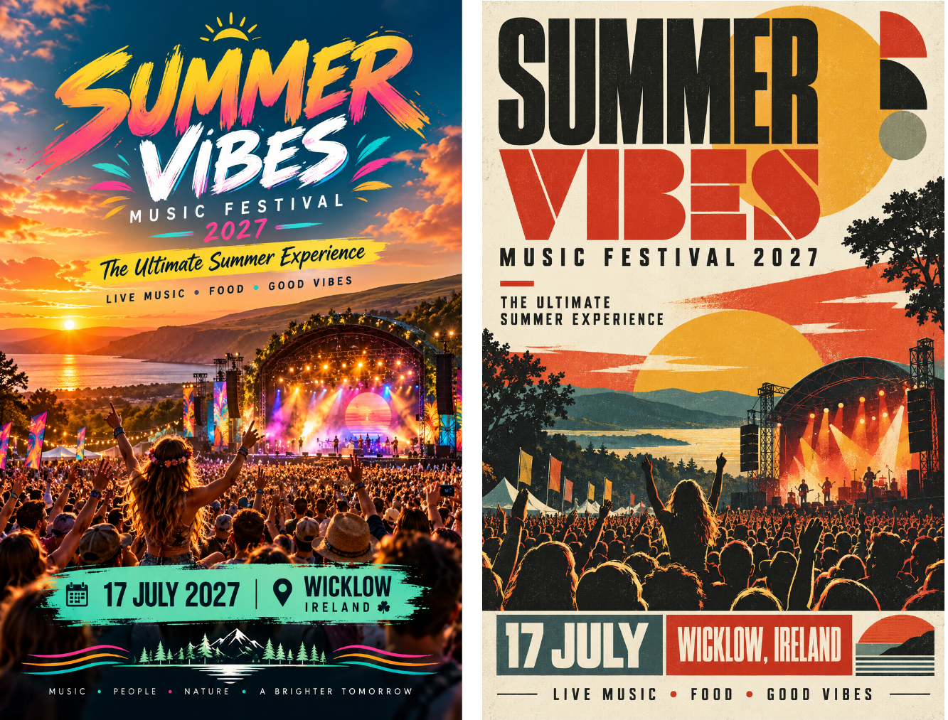
First attempt: a new chat for each prompt, but memory carried the stage, crowd and sunset across.
What made the difference
The obvious answer is that I gave it more information, but it's more specific than that. In the first prompt I used words like professional, stunning and eye-catching. They feel like instructions, but they don't say much. What does professional look like? With nothing else to go on, AI fills the gap with the most predictable answer.
In the second prompt I showed it what good looked like to me, and I didn't need any design vocabulary to do it. I picked examples I liked and asked AI to work out what they had in common. That's one of the most useful things about these tools: you can explain what you want with examples, comparisons and feedback instead of technical terms.
The other lesson is not to stop at the first result. If I were making this poster for real, my next step would be to rule out sunsets altogether and ask for three different concepts before it draws anything.
Sometimes you should just hire a designer
I run an AI consultancy, and I still don't think AI is always the right tool. Graphic design is a good example.
Would I use the second poster as the centrepiece of a big marketing campaign? Probably not without a designer involved. Producing an attractive image and solving a design problem are different things. A good designer understands your business, your audience and what you're trying to say. They know the rules and when to break them, and an odd layout or a colour combination that looks wrong at first can be exactly what makes a poster work. They'll also push back on your brief. You might ask for something colourful and exciting and be told, with good reason, that something minimal would land better with your audience.
You're paying for their judgement, not just their pictures. AI can help you explore ideas, but it doesn't bring that judgement or any real knowledge of your business.
Budget matters, of course. For a community fundraiser with €50 to spend on promotion, AI could be the right answer. For a brand identity, or a campaign with thousands behind it, a good designer is probably money well spent.
It's not just posters
The same thing happens everywhere AI gets used at work. It's now very easy to produce things that look finished: a neatly formatted report, a slick slide deck, a professional-sounding email. None of that means they're any good. A well-formatted report with nothing useful in it is still a bad report.
The risk is that we start judging the polish instead of the thinking. The questions that matter haven't changed. Who is this for? What is it meant to achieve? Could it be better? AI can help answer them, but someone still has to ask.
Getting better results rarely needs clever prompts. Give AI context and show it examples. Explain what you're trying to achieve, not just what you want it to make. Ask it to challenge you, and tell it when something isn't good enough. In my experiment the improvement came from better direction, and even then it took someone looking critically at the result to see what was still wrong.
That's a big part of my work at Tributary Consulting: helping businesses use AI to do better work, not just faster work, and to recognise when it's the wrong tool for the job.
Get in touch
The difference between my two posters came down to a few minutes of better direction. Most teams I work with are one or two habits like that away from much better results. If you’d like help finding yours, I run practical AI workshops for non-technical teams across Ireland. Book a free 20-minute call and we’ll work out where to start.